In the early days of mobile phones, some designs were really original, both in color and size, keyboard, performance, opening the phone … Who does not remember the trend of making phones that fit almost in the small pocket of jeans? Or the trend of mobile shell (for its closure system), or when the first units began incorporating a QWERTY keyboard instead of a String?
However, the fact is that in recent years, and the trend of smartphones with touchscreens, the feeling is that these devices have evolved little in size and almost all have a similar style in its physical design. The shapes of the corners are a little different, the materials may change, but overall, everyone expects the same from a smartphone: flat design, a large touch screen, minimal buttons and monocoque chassis.

Who nothing ventured nothing gained?
Some people think that the industry does not want to risk. If someone throws a smartphone with a radical design and is not sold, then it will be very easy to blame the design. And yet, when we talked about mobile phones (not smartphones), which made the difference with the competition was, in general, its physical design.
With the advent of smartphones, has been awarded productivity, we set aside concerns about the appearance and comfort to impose other eligibility criteria (camera, memory, power but also material). But fashion is always an important factor when we talk about a gadget that we carry with us and we spent a lot of our time.
So, now that the performance of modern phones in most price ranges has started to become acceptable, the inner workings of smartphones does not matter so much (though enthusiasts and developers will always have in mind these characteristics), so perhaps we have a unique opportunity for rebirth in smartphone design, which is more than just a look similar to those of all forms; a simple piece of plastic, metal and glass.
Award winning designs
But fortunately, there are still companies that are betting on the design because they know they are good examples of innovation and also because they want to provide answers to all those users looking for something more than just a useful and common device with other people .
A good example is the ZenFone 2, which has been awarded the prestigious IF Design Award. These awards, in force since 1954, an award given each year to the most innovative designs and quality. So much so that they are also known as the Oscars of the design.
In the case of ZenFone 2, the jury says it is an “ideal for all”, thin and with the ability to offer an experience of stunning visuals new generation Smartphone. It has also reviewed its 5.5-inch screen but with an ideal place to take in hand and enjoy multimedia entertainment balance.
The ZenFone 2 is a smartphone with a 5.5-inch screen with a chassis of a traditional device 5″. To achieve this, we reduced to a minimum framework creating a front screen-surface ratio of 72%.
The importance of the finished
As mentioned, the design is an important part of the terminals: what materials it is made, the housing having its design, the location of the buttons, ergonomics … Everything influences and affects the final design of the terminal.
For example, colors. The choice of a terminal in a variety of color ranges allows the user can also express your personality or your mood. Perhaps a discreet person never chooses bright yellow, nor a cheerful but chose for black ash.
The Asus ZenFone 2 range offers the choice of color and all versions will verify that the terminal is curved, allowing your hand is best to engage and use more comfortable and natural. In addition, this innovative design includes a button on the back of the terminal for such everyday tasks as making a photo (or selfie) or volume control is more simple and accessible.
Bezel smaller, bigger screen
Recently, there has been a clear obsession with the size of the bezel, especially noticeable in many design concepts that appear in the run up to the new releases of smartphones period. Again, the idea is that the user can benefit from a larger screen. People want, usually a type of smart phone design: elegant and clean lines, minimal overall design, finishes and quality materials.
That is, we have imposed the smartphone industry is practical and has focused on enhancing productivity and performance, so the design was forced, at a minimum level, to conform in all hardware. The candybar form line is useful for mounting modules and components, allows visualization of landscapes and portrait orientation. Users have also prevailed almost unanimously this format, the most common. Although this is not bad, the whole industry can benefit manufacturers having you spend more time thinking more about their designs, and less on the technical specifications of the device.
A little experimentation in design can quickly benefit the user where the software does not come, and even if a design does not work the first time, future revisions may provide a solution to these demands.
This is especially important in the flagships, wherein the design becomes very important for the customer who is willing to spend more than 700 dollars in his new team. If you look here and a clear distinction is awarded, which is often abroad, in a design and elegant finish, premium.
5G revolution
The next milestone in mobile communications networks will be the 5G, but is not expected to arrive until 2018 or 2020. Meanwhile, the size, shape and functionality of our mobile devices are evolving in many different directions.
Smartphones today have more capabilities than ever, as lenses integrated high quality camera, mobile applications that help productivity, streaming video and connectivity that allow millions of people to stay connected while in motion.
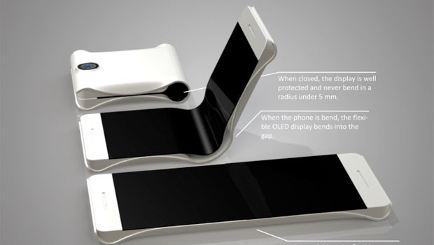
Expected future have phones with large screens, but pocket, and, above all, that can be folded and unfolded, thanks to Organic Light-Emitting Diode technology (OLED)
What should we expect to see in the development of smartphones in the near future, for example in the next five to ten years? This is probably a difficult question to answer accurately also because of the rapid pace of (r) technological developments. However, one in which everyone is betting big screens, but pocket, and, above all, that can be folded and unfolded, thanks to Organic Light-Emitting Diode technology (OLED).
It is also expected that the new generation of smart phones are smarter and more powerful than their predecessors. And they have curves with flexible components in their designs, to respond well to these screens that bend. Yet, they are more durable than ever. However, it is intended that the materials are high quality to ensure durability, which can prevent this flexibility until someone can find a way to unite the two ideals (flexibility and durability).
While some of these models also get larger, they can be thinner and lighter than ever, thanks to graphene.
Some also point out that, as more and write less hand-pointers and special pens for touch screens is one of the areas where it is also prevail over the design.
Luxury finishes
As we are all able to see the differences between a high-end car and a utility, we also know very well differentiate and know when a Smartphone is a product for most people and when other, by their materials and finishes, they are considered premium.
Some of the materials used, and the same system of almost craftsmanship, we are to make small works of art.
Whether true or not, the idea is to bring luxury to everyone, that is more accessible but at the same time, involving touch of distinction from other users. Behind all these designs usually have a team of people dedicated to extract the Best Available ideas and translate them into a mobile whose design is functional, but new and special.
